Inspired by 19th century rural pharmacies and folk herbalism, Juniper Field Supply is a fictional apothecary brand rooted in Southern grit and botanical craft. This project explores branding, print design, and vintage-inspired storytelling through a modern lens.
Using Illustrator and InDesign, I created a cohesive visual identity that blends weathered charm with clarity and intention.
The brand assets include:
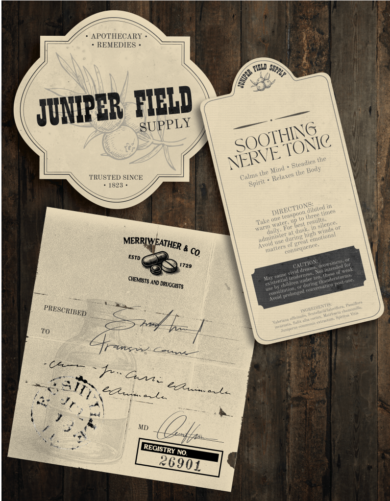
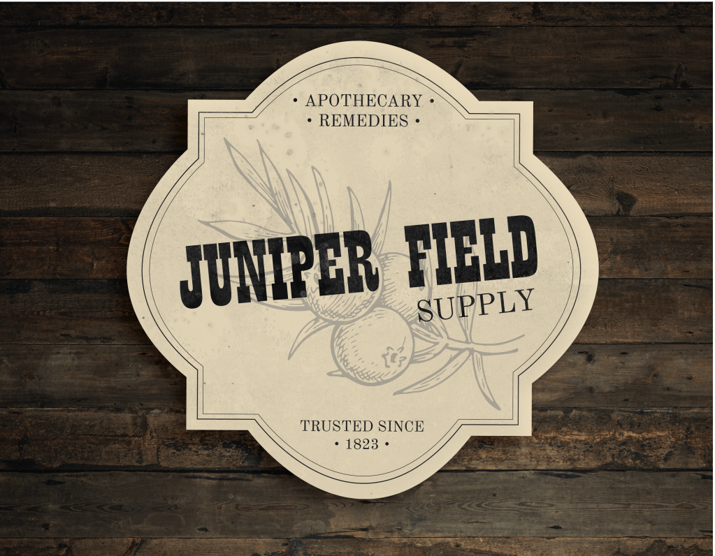
- A hand-drawn logo that feels both established and worn-in
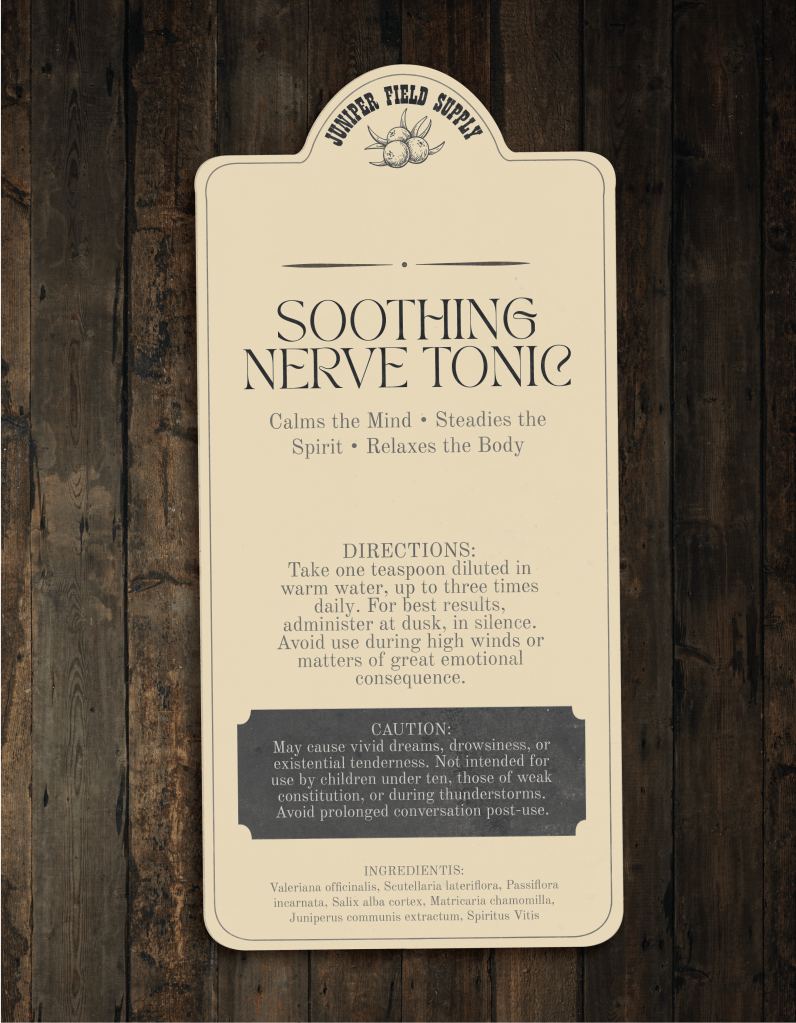
- A tincture bottle label for their signature Soothing Nerve Tonic, featuring botanical Latin, aged type, and layered textures
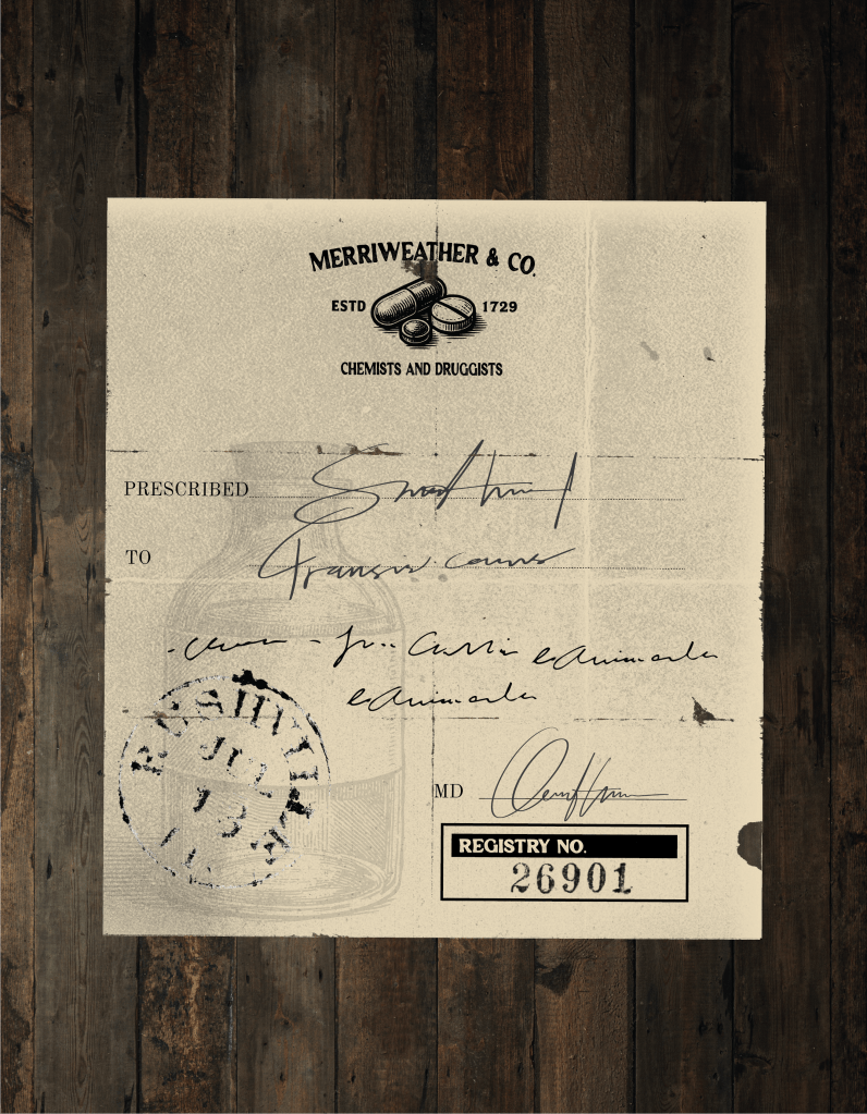
- A prescription pad mock-up styled after 1800s physician notes, complete with rubber-stamp effects and handwritten overlays
To achieve an authentic vintage look, I worked with multiple overlay textures, subtle ink bleed effects for stamps, and typographic choices inspired by old tonic bottles. The result is a set of pieces that feel pulled from a forgotten field cabinet — practical, peculiar, and deeply rooted in place.