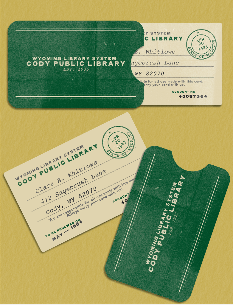
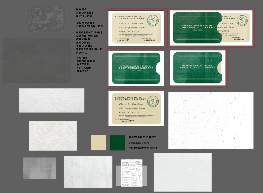
This project might look minimal at first glance, but it came with a ton of learning! It was my first real dive into realistic prop-making, and one of the biggest challenges was getting the textures just right. I wanted that moment where someone looks at it and goes, “Wait, this isn’t real?” I ended up layering nine different textures to nail that rustic, worn-in vibe.
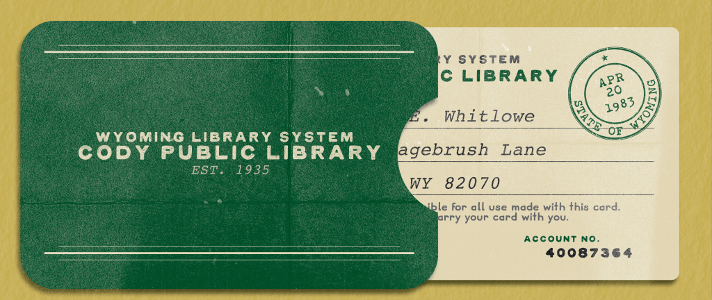
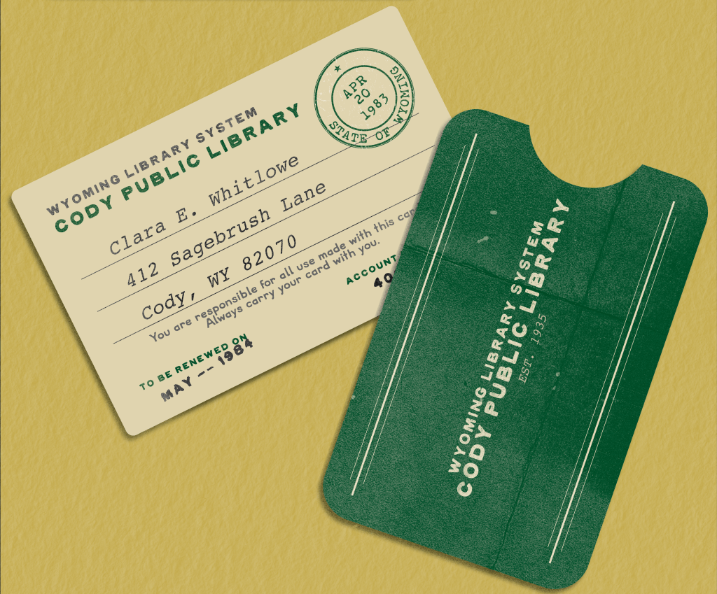
On top of all that texture work, I also pulled in a couple of my favourite typefaces, mainly COWBOY and RANCH WATER by Meg Burk (honestly, I’d collect every typeface she’s ever made if I could). Another fun challenge was designing stamp-style text. Getting the renewal date and account number to look authentic took a lot of trial and error, but I’m really proud of how it turned out.
Normally I mock things up in Photoshop, but for this one I pushed myself to use Illustrator, playing with drop shadows and lighting overlays in a new way.